Amazon
Holiday Kids Gift Book
Amazon's digital destination for families shopping for the holidays.
Role
Creative Director
- Outlining creative scope to brief partner teams
- Fascilitating collaboration with creative teams (for the digital and physical book), developers, engineering, and motion designers
- Conducting design reviews and providing hands-on direction (UX, UI, Motion)
- Overseeing and completing user testing (during design development and QA)
- Communicating status with internal stakeholders and leadership
- Project management support for scoping, establishing deliverables, and meeting milestones
Brief
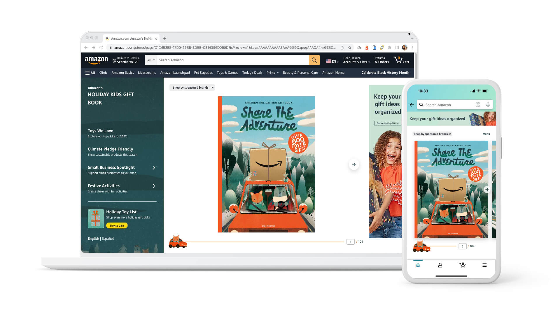
Amazon needed a creative team to design and build the digital counterpart for the physical Holiday Kids Gift Book. Now in it's 5th year of production, it is the first piece of creative many customers see from Amazon during the holiday season.
Idea
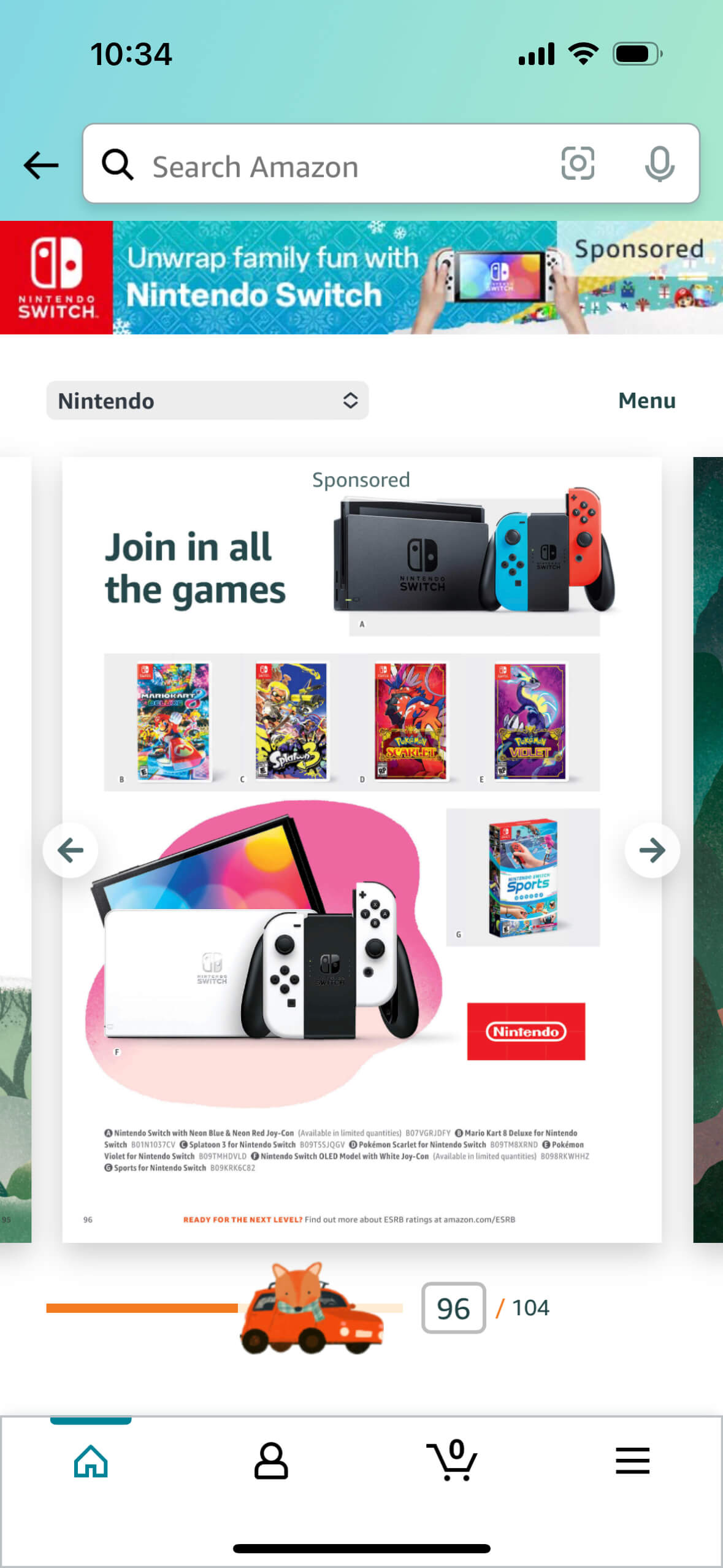
Our creative team would own the Digital Holiday Kids Gift Book (DHKGB), creating the online destination for shoppers from the physical book or those already online, in addition to ensuring advertisers are built into the experience to help shoppers discover their deals.
Experience
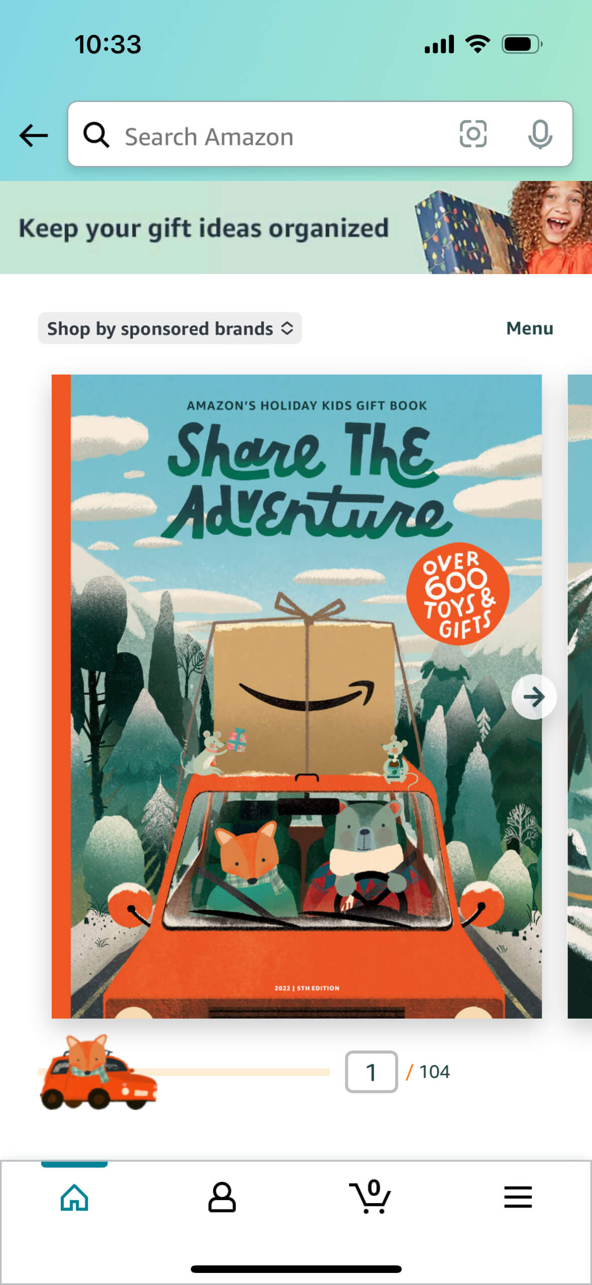
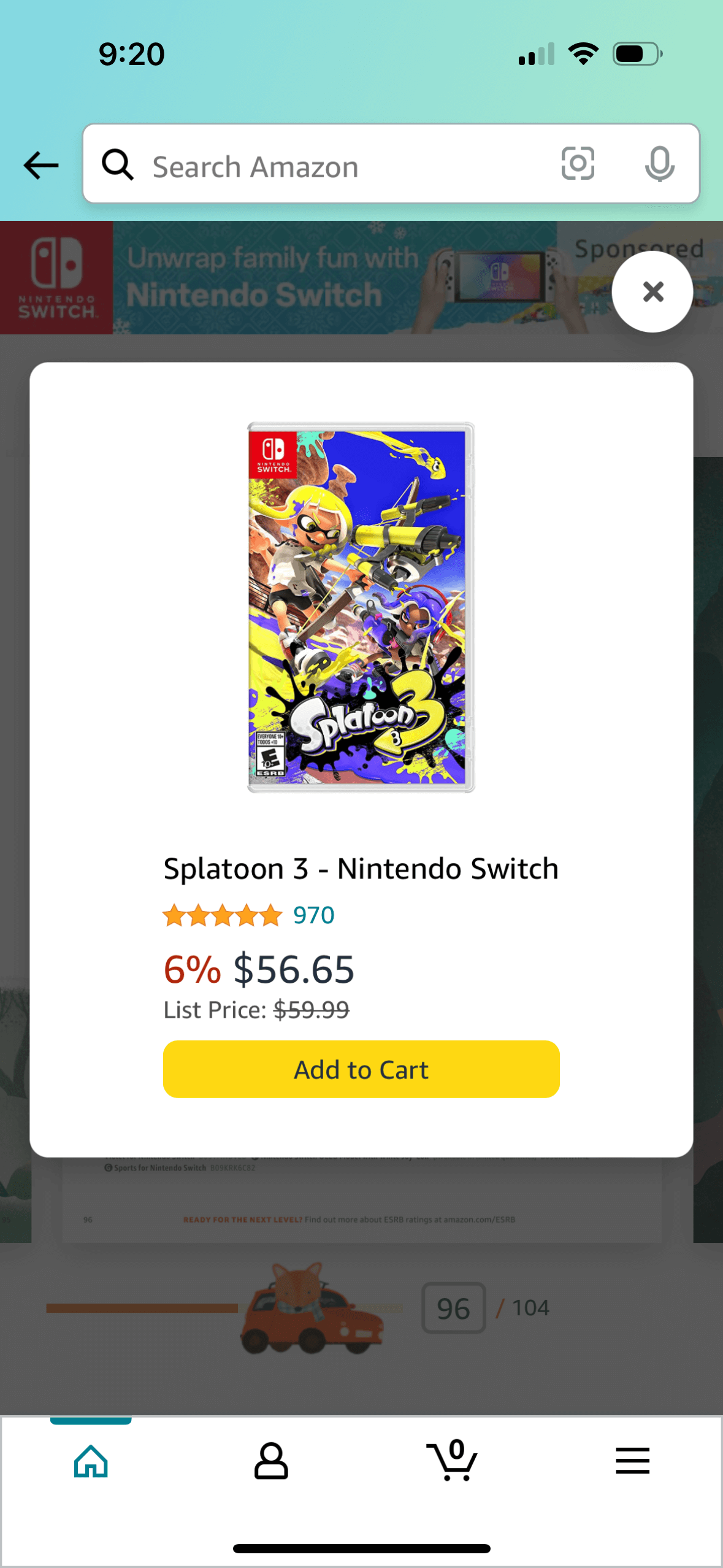
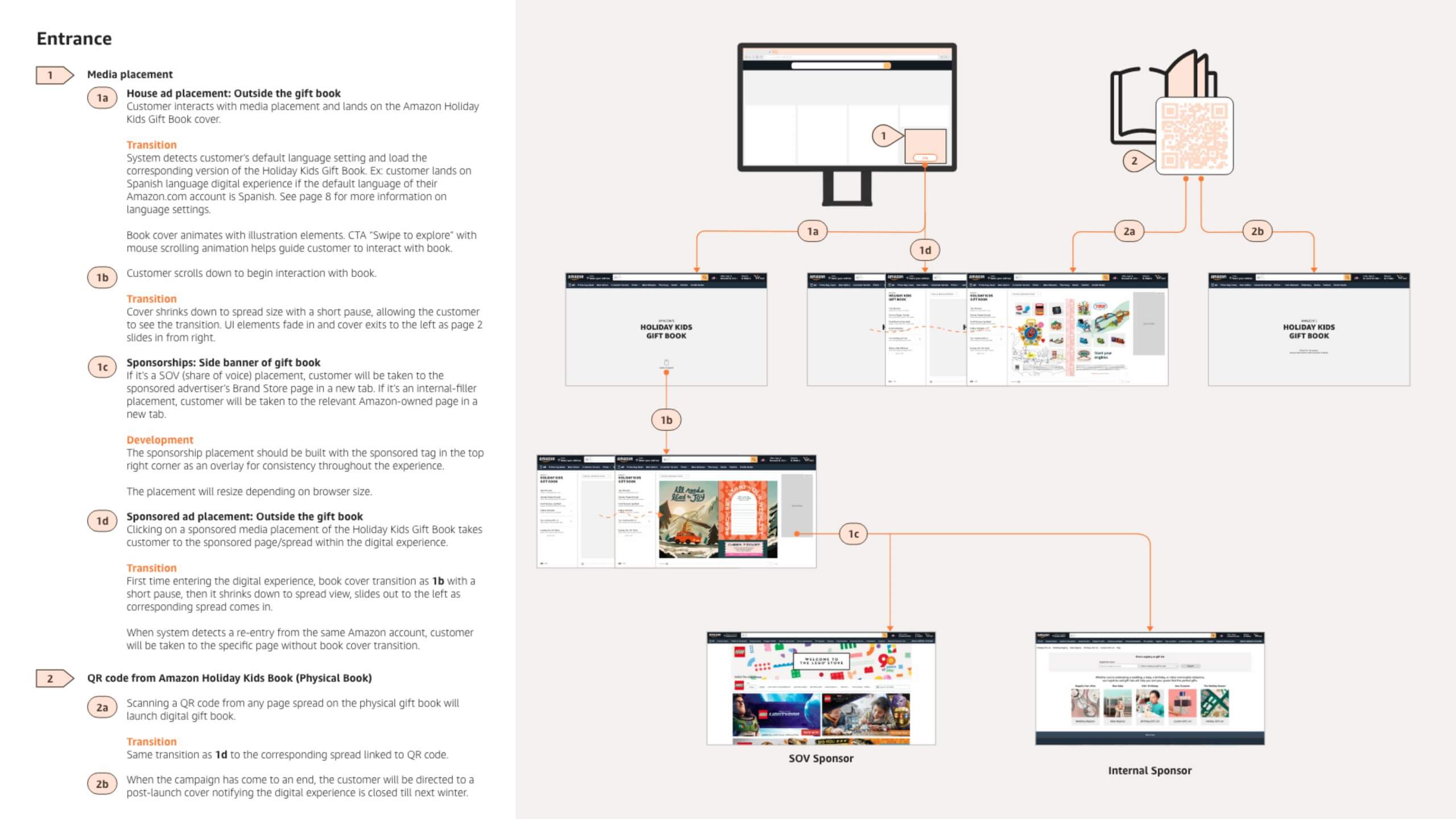
The DHKGB was the primary location customers shopped from 600+ products featured in the physical gift book. Customers who browse the printed version could scan a QR code on pages, land on the digital version, shop, and complete purchase.
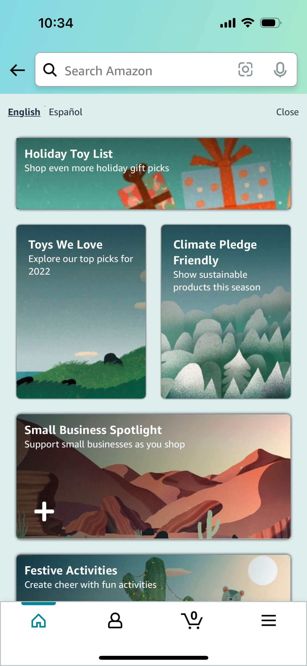
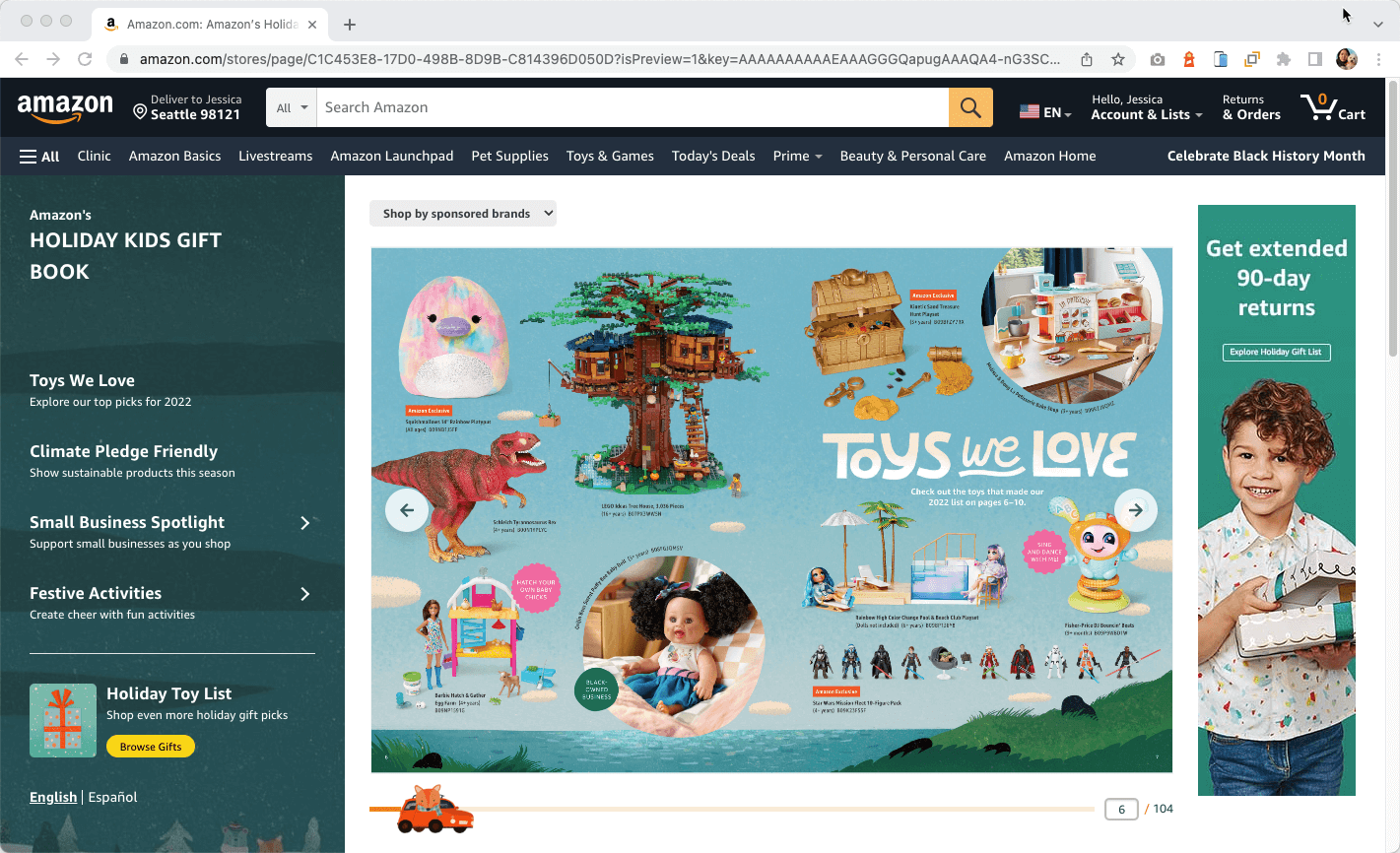
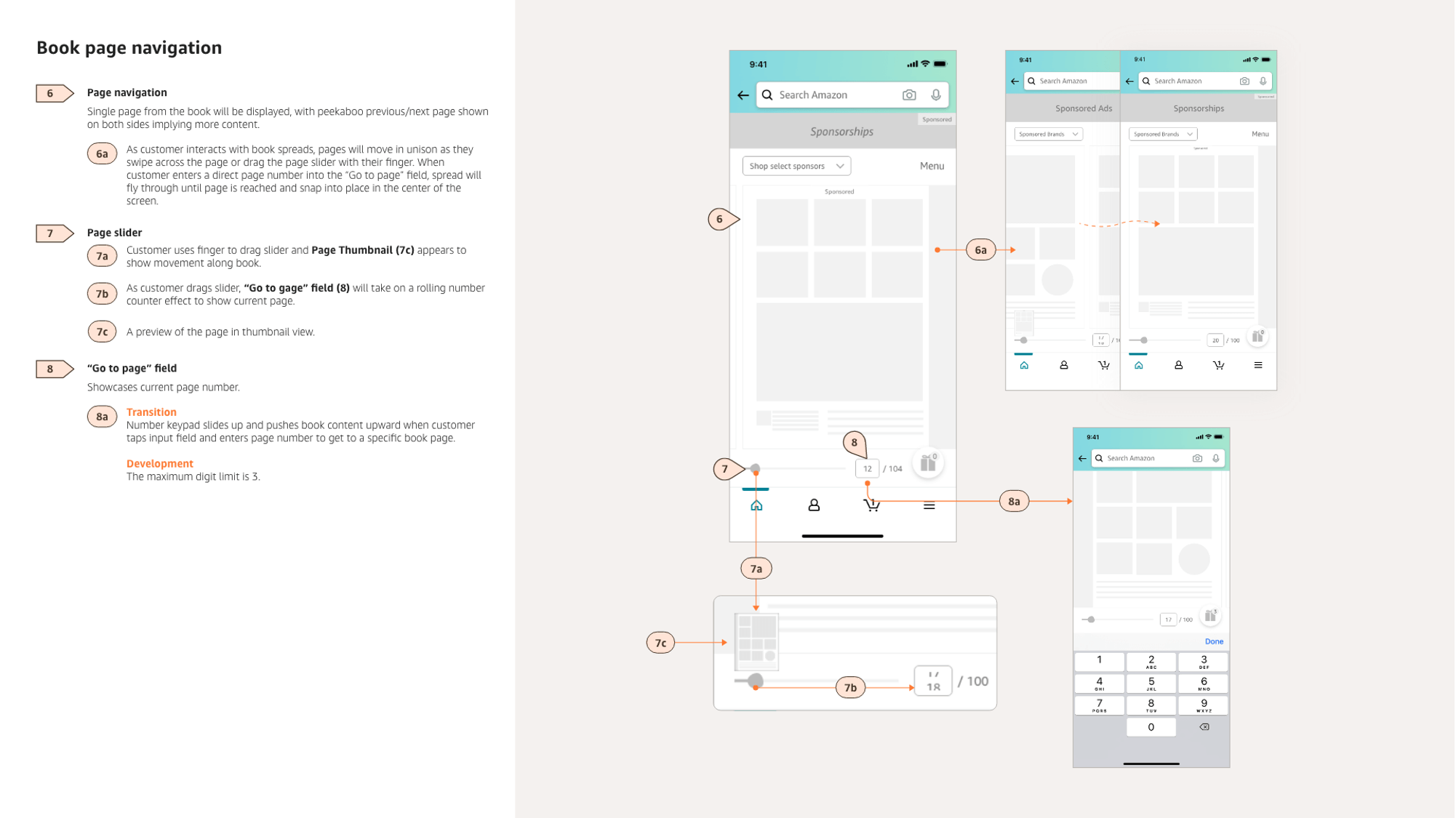
Designed to be mobile-first, this year's version of the DHKGB improved how to browse through the 104 pages, provided ways to jump to key branded areas, and highlighted collections celebrating diverse sellers (such as toys from small businesses). For the first-time, the DHKGB was also available in English and Spanish, giving the full experience to our customers in two languages.
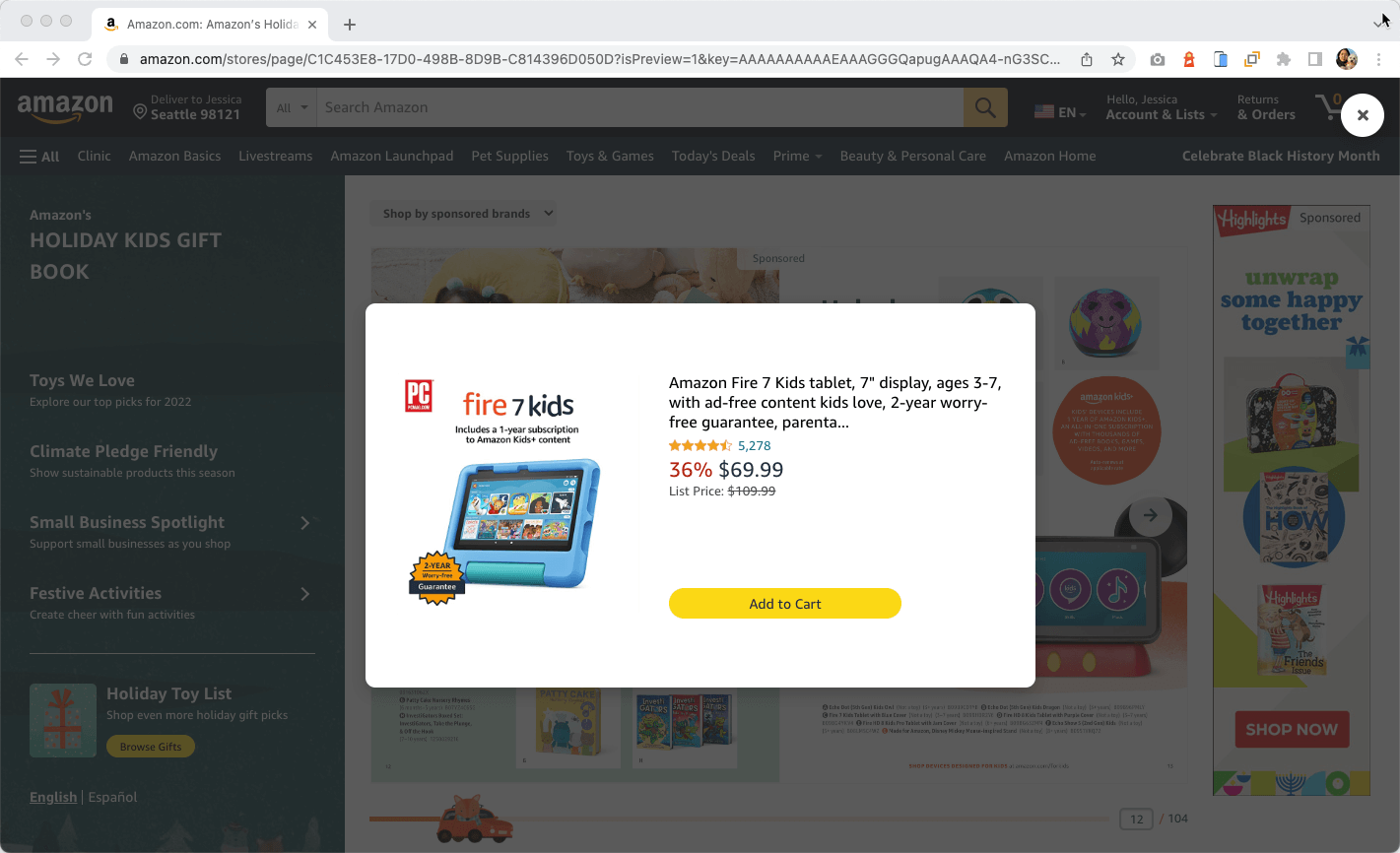
As Creative Director, I partnered closely with the physical book's creative team to ensure we received assets and updates to allow us to create the digital version in tandem. I lead designers (UX, UI, Motion), and worked with a full-stack team of developers to collaborate on building the complete solution, which accommodates both shoppers and advertisers alike. This included providing requirements to engineers to build a custom mini ad server, to allow contextual ads to be displayed in appropriate parts of the digital book (with the intent to be scaled to future projects). User testing was conducted with an early prototype to validate design decisions, and thorough rounds of User Acceptance Testing aided us in passing QA to launch on time.
Results
- 30M copies of the physical Holiday Kids Gift Book (HKGB) were shipped to households
- 24.4M recipients made a toys purchase
- 1.6M unique customers visited the digital book and generated 30M impressions, with +800K add-to-carts (over 90% coming from mobile devices)
- Average ad clickthrough rate increased more than 3x compared to previous year
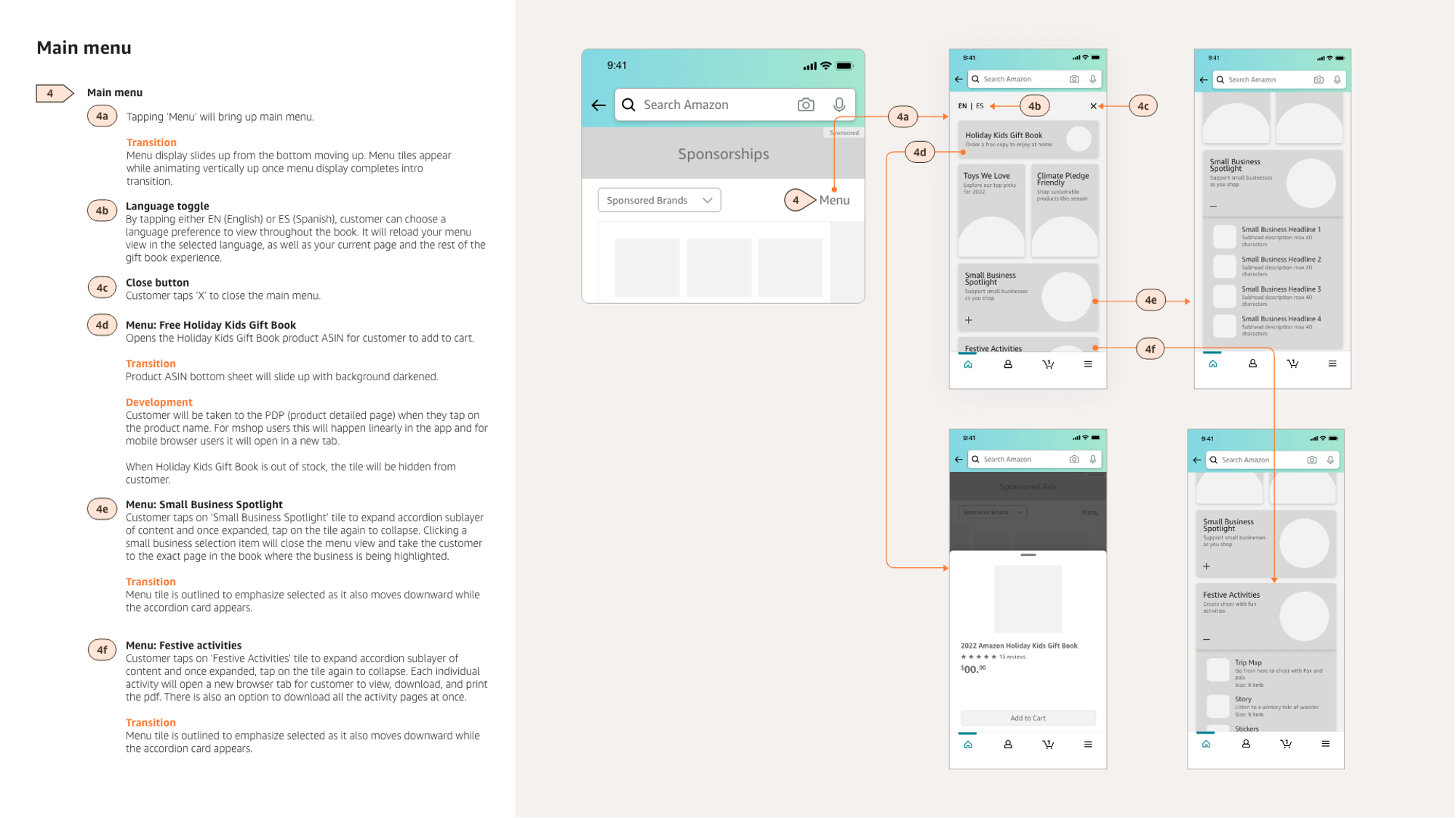
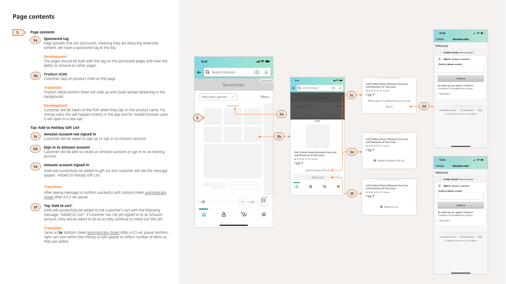
Wireframes: Mobile
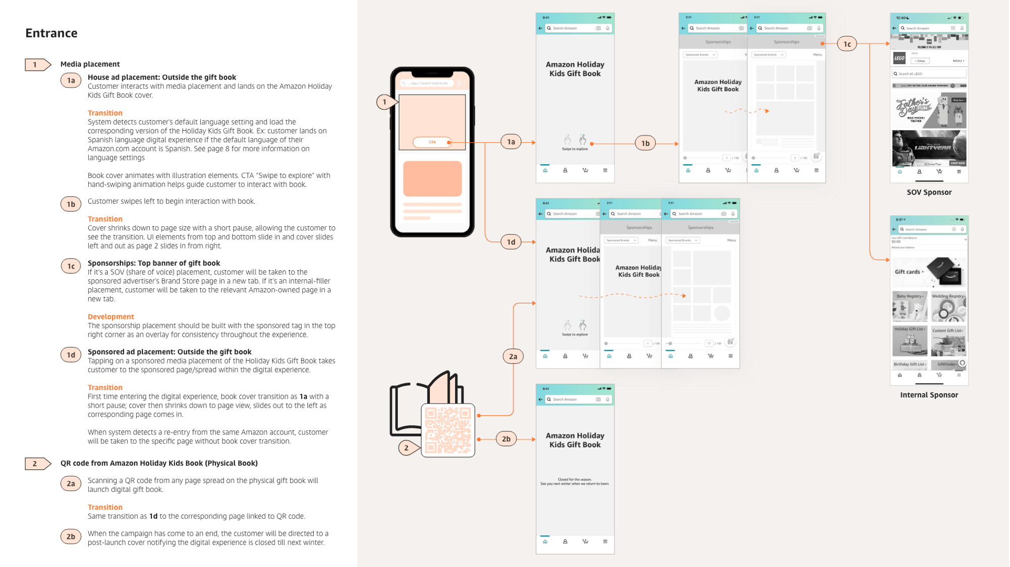
Wireframes: Desktop
Prototype + User testing
Mobile wireframes were turned into an interactive prototype, showing key screens, functionality, and animated transitions.
This was used to align expectations with our internal team (developers, engineers, and motion designers), and to be used for user testing (via UserTesting.com).
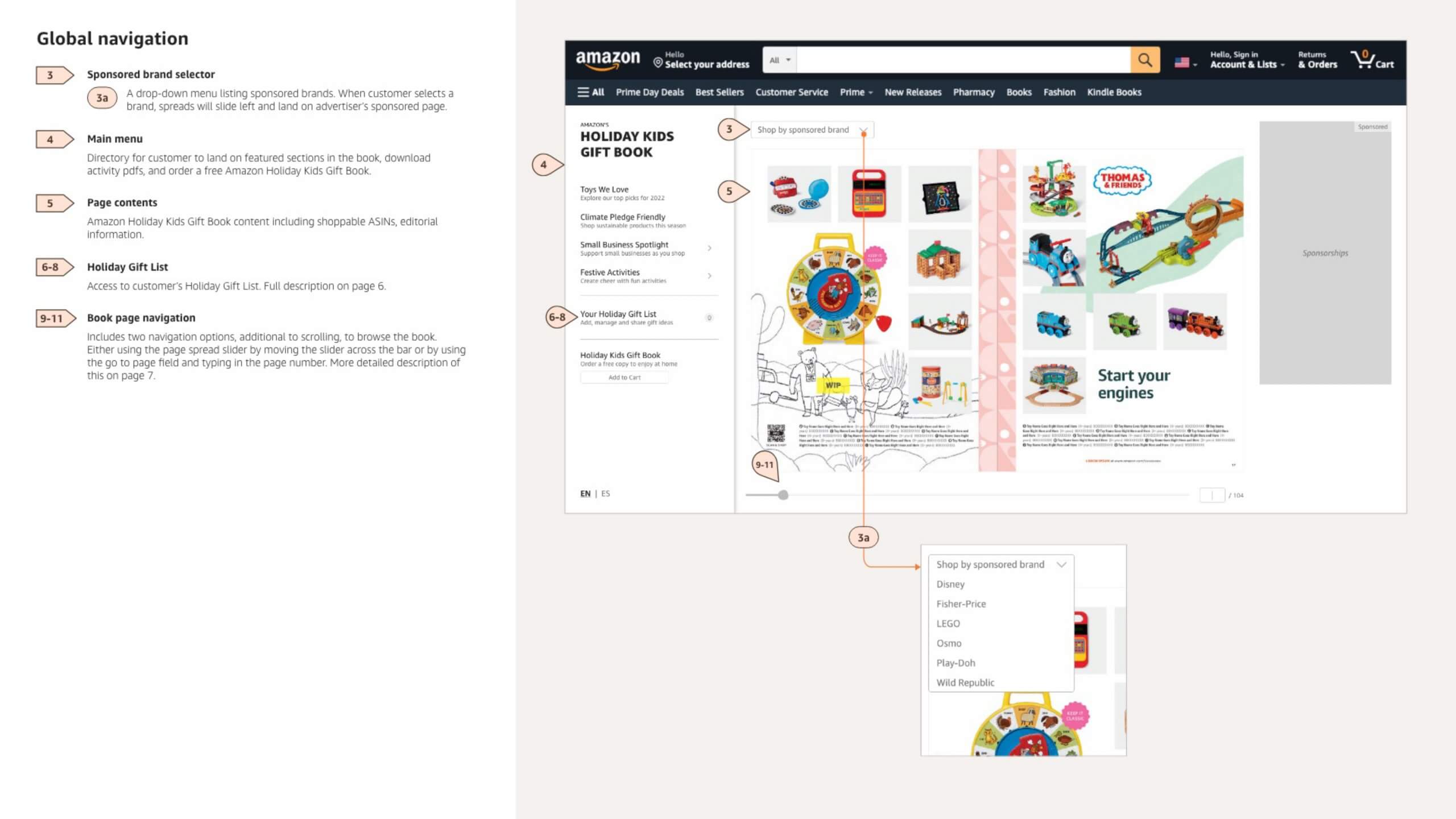
User testing was new for my design team, so I guided them through the planning, conducting, and assessment phases. Findings informed how we would finalize the DHKGB experience, with emphasis on adding key words to make icons more understandable (Ex. Sharing your gift list), and updating the menu to contain items participants navigated there to look for (Holiday Gift List).
Study purpose:
To evaluate how users understand and navigate through the mobile experience.
Study participants:
- Age 20+
- Reside in United States or Canada
- Mix of incomes, ages, ethnicities, genders, education levels, and employment
Study methodology:
- 10 participants total
- Unmoderated sessions recorded via video
- 15-min user test of wireframe prototype experience (not fully functional)
- Total of 2 general questions & 9 tasks
Key findings:
- All participants were able to locate a specific item and add it to their cart.
- “That was easy, and simple. It was really easy to navigate to owl, like, what! That’s crazy.”
- “That was easy, and simple. It was really easy to navigate to owl, like, what! That’s crazy.”
- All participants were able to navigate to a specific brand page (functionality only available to sponsoring advertisers).
- “That was pretty easy. Partially because it literally says ‘Shop sponsored brands’.”
- Half of participants located the menu item to shop "Climate Pledge Friendly" products with a detour, due to confusion between the DHKGB menu and the Amazon app main menu.
- “I found it on the menu. I don’t know if that’s how I’m supposed to find it, but I found it on menu.”
- “I found it on the menu. I don’t know if that’s how I’m supposed to find it, but I found it on menu.”
- Participants had difficulty locating their Holiday Gift List, looking first in the DHKGB menu.
- “Initially I would go to the menu and look for it, but I noticed there a “1” next to the gift now, so I’m gonna assume I gotta click here.”
- 80% of participants were able to share their Holiday Gift List, and there was confusion around the clarity of the share icon.
- "“I wish it would say share next to it, just so it’s easier to identify that share it...you see this button everywhere, it (the icon) blends in, people stopped noticing as much”
Final design
